
Create a streamlined font design tutorial using the Photoshop Path tool
The finished result:

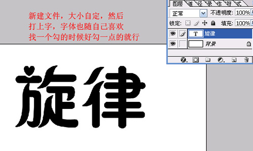
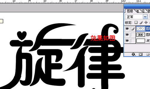
New text, the size is customized, and then hit the word, the font is also as you like to find a hook when a good hook point on the line
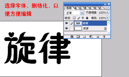
Select fonts and raster them for easy editing
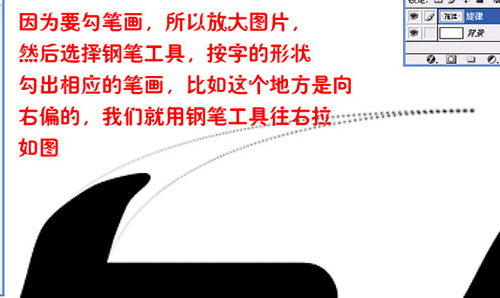
Because you want to draw, so enlarge the picture, and then select the pen tool, according to the shape of the word to draw the corresponding strokes, for example, this place is tilted to the right, we use the pen tool to pull right, as shown in the figure
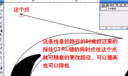
This line is pulled over when the path is pulled, hold down the Ctrl key and click this point to change the path at will, can be raised or lowered.
If you feel like it, then turn the path into the Selection tool, create a new layer and fill it with the appropriate color. The reason for creating a new layer is to make it easier to change later.
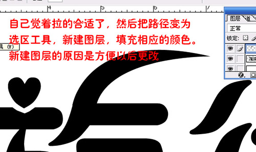
If you feel like it, then turn the path into the Selection tool, create a new layer and fill it with the appropriate color. The reason for creating a new layer is to make it easier to change later.

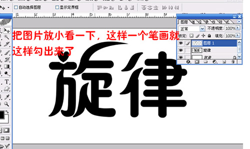
Look down at the picture a little bit, so that a stroke comes out like this
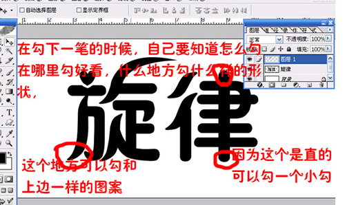
When drawing the next stroke, you should know how to draw, where to draw good, what place to draw what shape.
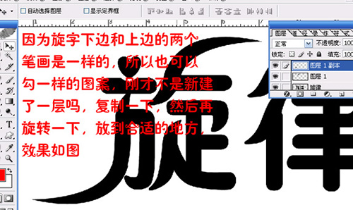
Because the bottom of the scroll and the top two strokes are the same, so you can also hook the same pattern, didn't you just create a new layer, copy it, and then rotate it, put it in the appropriate place, the effect is shown in the picture
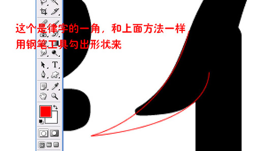
This is the corner of the character, and as in the above method, use the pen tool to draw the shape
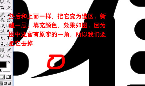
And then, just like above, turn it into a selection, create a new layer, fill in the color, and look like this, because we still have a corner of the original word, so we're going to remove it.
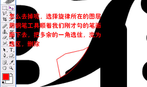
How to get rid of it? Select the layer where the melody is, use the Pen Tool to follow the pen we just drew, select the extra corner, turn it into a selection, delete.
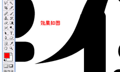
The effect is shown in the figure
Let's hook the top of the law
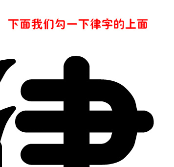
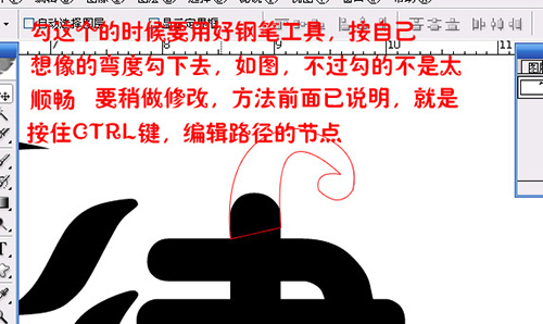
Check this time to use the pen tool, according to their imagination of the curve to hook down, as shown in the picture, but the hook is not too smooth, to modify a little, the method has been explained before, is to hold down the Ctrl key, edit the path of the node.
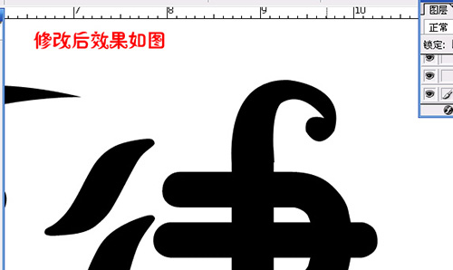
The modified effect is shown in the figure
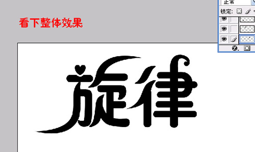
Look at the overall effect
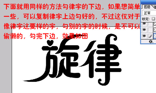
Below use the same method to hook the bottom of the law, if you want to be simple, you can copy the top of the law, but this is only for words like law, hook other words, you can not be lazy, hook the bottom, the effect is as shown in the figure
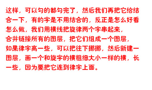
In this way, we can hook all the hook, and then we combine it, some words are not combined, anyway, how to do what looks good, we use horizontal lines to string the melody two words, merge and link all the layers, put them into a layer, if the law is higher, you can move down, and then create a new layer, Draw a horizontal that is the same size as the horizontal width of the spiral character, longer because it is attached to the rhythm character.
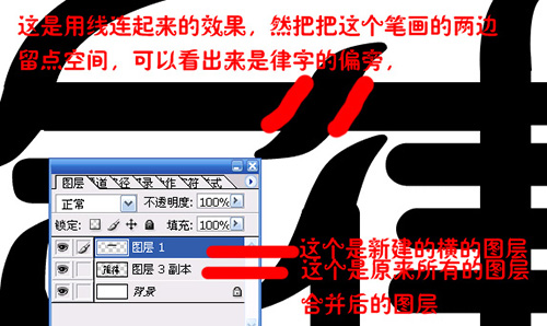
This is the effect of connecting lines, and then leaving some space on both sides of this stroke, you can see that it is the side of the rhythm
Now on the horizontal layer, let's use the Pen Tool to select this part of the image, change the path to selection, and delete it.
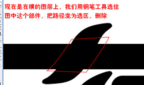
The effect is shown in the figure
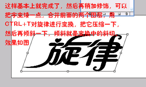
So that's basically done, and then a little bit of polish, you can make the word a little bit shorter, merge the two previous layers, transform the melody with Ctrl+T, compress it a little bit, and then tilt it a little bit, and the slant is the diagonal cut of the transform. The effect is shown in the figure
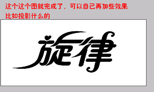
That's it, you can add your own effects, like a projection, you know
Related article
-

ps How to make a picture stitching effect of the font? ps collage text effect design method
ps How to make a picture stitching effect of the font? ps want to make a splicing effect of the text, how to make it? Below we will take a look at the design method of ps collage text effects, please see below for details2021-07-26 -

ps how to design tandem text effects? ps interspersed font implementation method
ps how to design tandem text effects? ps want to design a series of text effects, how to design it? Let's take a look at the implementation method of ps series font, please see below for details2021-06-28 -
 Today, we use PS to design a dynamic splash text effect, mainly using the displacement filter in PS to deal with specific scenes, showing the dynamic effect of splashing, let's take a look2021-05-17
 -

Teach you how to use PS to create neon radio text effects tutorial
This tutorial will teach you in detail how to make cool live fonts. Neon effects combine text, radio waves, and starlight. Colorful colors are very cool here, and the light can effectively catch people's eyes. I hope you can draw parallels and design Chinese as well2021-04-23 -

Ps How to add text effects to roads?
Ps is very easy to repair map software, in ps want to add text to the highway how to operate? Let's take a look below2021-01-29 -

ps how to do text expansion effect ps design expansion text effect tutorial
Photoshop how to do text expansion effect? Through ps can produce a variety of kinds of text effects, bloated text is one of them, the following for you to bring the ps design expanded text special effects tutorial. Interested friends may wish to read the following content for reference2021-01-18 -

ps how to make stone text ps make simulation stone texture text effect tutorial
ps How to make stone text? Mainly use the text tool and rectangle tool, put the rectangle into the text, and then add the projection effect, the following for you to bring the ps production simulation stone texture text effects tutorial. Interested friends may wish to read below2020-11-30 -

ps design and make a S dream purple flame effect text tutorial
This tutorial teaches you to use ps to design and produce an S dream purple flame effect text, the entire effect is more cool, look more like a dragon hovering on this font, the flame word effect is realistic, but more time-consuming, flames and so on need to draw a line2020-11-02 -

ps How to design amethyst text effect? ps purple stone text effect production tutorial
ps How to design amethyst text effect? If you want to make lucky amethyst text, how to design it? Below we will take a look at ps design purple stone text effects production tutorial, the need for friends can refer to2017-09-08 -
 This tutorial teaches the script house of text effects learners to use PS to create a mysterious universe scene of scientific and technological text effects method, the tutorial by the combination of scene synthesis and text effects, mainly learn how to create a sense of mystery, science fiction, interested2017-06-27
Latest comments