
巧用 :has & drop-shadow 实现复杂布局效果
 我要评论
我要评论
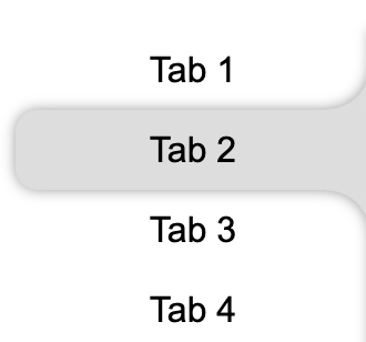
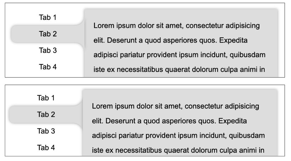
最近,群里聊到了一个很有意思的布局效果。大致效果如下所示,希望使用 CSS 实现如下所示的布局效果:

正常而言,我们的 HTML 结构大致是如下所示:
<div class="g-container">
    <div class="g-nav">
        <ul>
            <li>Tab 1</li>
            <li>Tab 2</li>
            <li>Tab 3</li>
            <li>Tab 4</li>
        </ul>
    </div>
    <div class="g-main">
        <ul class="g-content">
            <li>...</li>
            <li>...</li>
            <li>...</li>
            <li>...</li>
        </ul>
    </div>
</div>
对于 Hover 导航 Tab 时候的内容切换,暂且不谈。本文,我们核心想探讨的是两个点:
一是对于如下所示的不规则布局,应该如何实现:
并且,这里我们可能还需要给它加上阴影效果:
如何配合 Hover 动作,实现整个切换效果
带着这两个问题,我们一起来尝试慢慢把这个效果实现。
借助伪元素实现不规则按钮
首先,我们需要实现这个效果:
这个,其实在很多篇文章都有提及过:
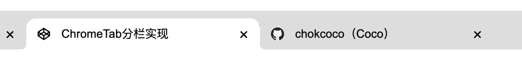
想一想,这里其实就是竖向的 Chrome 分 Tab 的效果:
像是这样:
我们对这个按钮形状拆解一下,这里其实是 3 块的叠加:
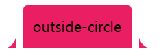
只需要想清楚如何实现两侧的弧形三角即可。这里还是借助了渐变 -- 径向渐变,其实他是这样,如下图所示,我们只需要把黑色部分替换为透明即可,使用两个伪元素即可:
代码如下:
<div class="outside-circle"></div>
.outside-circle {
    position: relative;
    background: #e91e63;
    border-radius: 10px 10px 0 0;
    &::before {
        content: "";
        position: absolute;
        width: 20px;
        height: 20px;
        left: -20px;
        bottom: 0;
        background: #000;
        background:radial-gradient(circle at 0 0, transparent 20px, #e91e63 21px);
    }
    &::after {
        content: "";
        position: absolute;
        width: 20px;
        height: 20px;
        right: -20px;
        bottom: 0;
        background: #000;
        background:radial-gradient(circle at 100% 0, transparent 20px, #e91e63 21px);
    }
}
即可得到:

我们照葫芦画瓢,即可非常轻松的实现竖向的相同的效果,示意图如下:

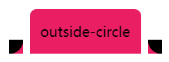
利用 drop-shadow 实现按钮阴影
好,接下来,我们需要给按钮添加上阴影效果,像是这样:
因为使用了两个伪元素,当前单个按钮在 Hover 状态下的大致代码如下:
li {
    position: relative;
    width: 160px;
    height: 36px;
    border-radius: 10px 0 0 10px;
    background: #ddd;
    &::before,
    &::after {
        content: "";
        position: absolute;
        right: 0;
        border-radius: unset;
    }
    &::before {
        width: 20px;
        height: 20px;
        top: -20px;
        background: radial-gradient(circle at 0 0, transparent, transparent 19.5px, #ddd 20px, #ddd);
    }
    &::after {
        width: 20px;
        height: 20px;
        bottom: -20px;
        background: radial-gradient(circle at 0 100%, transparent, transparent 19.5px, #ddd 20px, #ddd);
    }
}
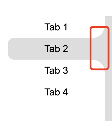
如果使用 box-shadow 肯定是不行的,整个效果就会露馅:
尝试给按钮添加一个 box-shadow: 0 0 5px 0 #333:
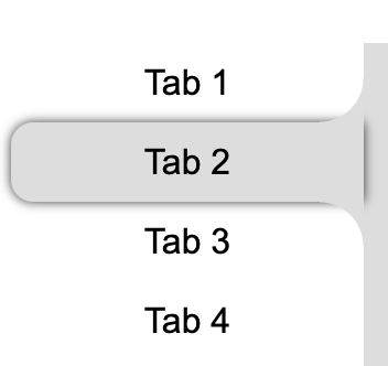
弯曲的连接处,明显没有阴影效果,怎么解决呢?
嗯哼,老读者一定也知道,这里我们需要对整个可见部分添加阴影,需要使用 filter:drop-shadow()。
drop-shadow()滤镜的作用用于创建一个符合元素(图像)本身形状(alpha 通道)的阴影。其中,最为常见的技巧,就是利用它生成不规则图形的阴影。
因此,我们把上述的 box-shadow 替换成:filter: drop-shadow(0 0 5px #ddd):

这样,我们就实现了基于单个不规则按钮的阴影效果。
但是,显然事情还没有结束。
修改布局结构,再借助利用 drop-shadow 实现统一阴影
记得我们上面提到过的 HTML 的布局吗?正常而言,右侧的主体内容和左侧的导航,结构是分离的:
<div class="g-container">
    <div class="g-nav">
        <ul>
            <li>Tab 1</li>
            // ...
        </ul>
    </div>
    <div class="g-main">
        <ul class="g-content">
            <li>...</li>
            // ...
        </ul>
    </div>
</div>
因此,这里最为麻烦的地方在于,左侧按钮的阴影,需要和右侧的主体内容连在一起!,所以当我们给右侧的 .g-main 也添加上相同的 filter:drop-shadow() 时,整个效果会变得非常奇怪:
// 当前被 Hover 的 li
.g-nav li {
    filter: drop-shadow(0 0 5px #ddd)
}
// 右侧的主体
.g-main {
    filter: drop-shadow(0 0 5px #ddd)
}
无论层级谁在上,整体阴影的展示都会瑕疵:
所以,如果想要实现整个元素的阴影是一整个的整体的效果,我们就不得不另辟蹊径。
这里,我们的思路如下:
- 可以尝试在
.g-main中,添加一组与.g-nav相同的结构,负责样式层面的展示 - 把新增的结构,利用绝对定位,让其与实际的导航位置重叠
- 在原本的
.g-nav中,通过:has()伪类,传递实时的 Hover 状态
基于此,我们需要改造一下我们的结构:
<div class="g-container">
    <div class="g-nav">
        <ul>
            <li>Tab 1</li>
            <li>Tab 2</li>
            <li>Tab 3</li>
            <li>Tab 4</li>
        </ul>
    </div>
    <div class="g-main">
        <ul class="g-status">
            <li></li>
            <li></li>
            <li></li>
            <li></li>
        </ul>
        <ul class="g-content">
            <li>...</li>
            // ...
        </ul>
    </div>
</div>
仔细看上面的结构,我们多了一组 .g-stauts 结构,放置在了 .g-main 之下。其 li 个数与实际的导航 .g-nav 保持一致,并且高宽大小都是一模一样的。
并且,可以利用绝对定位,让其完全叠加在 .g-nav 的位置上。
然后,我们把上述类 Chrome Tab 样式的不规则按钮结构的 CSS 代码结构,都赋给 .g-status 下的 li。
此时,由于不规则按钮结构和右侧的主体内容结构,其实是在一个父 div 之下,所以,我们只需要给 .g-main 元素添加 filter: drop-shadow(),就可以实现一整个整体的阴影效果:
最后,我们利用 :has() 伪类,传递实时的 Hover 状态,把内外的结构连接起来。
最为核心的代码如下:
.g-main {
    background: #ddd;
    filter: drop-shadow(0 0 3px #999);
}
.g-status {
    position:absolute;
    left: -160px;
    top: 0;
    width: 160px;
    li {
        width: 160px;
        height: 36px;
        position: relative;
        background: #ddd;
        opacity:0;
        &::before,
        &::after {
            content: "";
            position: absolute;
            right: 0;
            border-radius: unset;
        }
        &::before {
            width: 20px;
            height: 20px;
            top: -20px;
            background: radial-gradient(circle at 0 0, transparent, transparent 19.5px, #ddd 20px, #ddd);
        }
        &::after {
            width: 20px;
            height: 20px;
            bottom: -20px;
            background: radial-gradient(circle at 0 100%, transparent, transparent 19.5px, #ddd 20px, #ddd);
        }
    }
}
.g-status li {
    opacity: 0;
}
.g-nav:has(li:nth-child(1):hover) + .g-main {
    .g-status li:nth-child(1) {
        opacity: 1;
    }
}
.g-nav:has(li:nth-child(2):hover) + .g-main {
    .g-status li:nth-child(2) {
        opacity: 1;
    }
}
.g-nav:has(li:nth-child(3):hover) + .g-main {
    .g-status li:nth-child(3) {
        opacity: 1;
    }
}
.g-nav:has(li:nth-child(4):hover) + .g-main {
    .g-status li:nth-child(4) {
        opacity: 1;
    }
}
什么意思呢?解释一下:
- 事先把每一个 Tab 被 Hover 时的样式,都写在了
.g-stauts中,并且再提醒一下,这个结构是在.g-main之下的。然后,默认设置隐藏即可; - 实际触发 Hover 动画效果,是正常的
.g-nav下的一个一个的 li 结构; - 当
.g-nav下的一个一个的 li 被 Hover 时,我们通过:has()伪类,能够拿到此事件,并且根据当前是第几个元素被 hover,对应的控制实际在.g-main下的结构进行样式的展示;
不太了解的 :has() 伪类的小伙伴,可以先读一读这篇文章 -- 浅谈逻辑选择器 is、where、not、has,此伪类的诞生,填补了在之前 CSS 选择器中,没有父选择器的空缺。让我们能够在父元素节点上,根据子元素的状态变化,做出样式的调整。
这样,我们就最终实现了我们文章一开始的效果:
文章可能有部分内容没有阐述的很清晰,完整的代码其实行数非常之少,对文章内容还不太理解的建议戳进 DEMO 中看看。
完整的 DEMO 效果:CodePen Demo -- Tab Hover Effect
有小伙伴会有疑问,为什么不直接在 .g-nav 导航结构和 .g-main 结构的父节点直接添加 drop-shadow(),不是也可以实现一样的效果吗?
是的,对于本文贴出的代码效果,是可以实现一样的效果。但是,实际业务中,.g-nav 会更复杂,它们的共同父元素下也可能还有其他元素,实际情况远比本文贴出来的结构复杂,因此借助多一层虚拟 ul,实际上是更好的解法。
到此这篇关于巧用 :has &amp; drop-shadow 实现复杂布局效果的文章就介绍到这了,更多相关drop-shadow复杂布局内容请搜索脚本之家以前的文章或继续浏览下面的相关文章,希望大家以后多多支持脚本之家!
相关文章
-
CSS Grid 是一种二维布局系统,可以同时控制行和列,相比 Flex(一维布局),更适合用在整体页面布局或复杂模块结构中,这篇文章主要介绍了前端CSS Grid 布局详解,需要的朋2025-04-16
-
CSS 中的 padding 和 margin 是两个非常基础且重要的属性,它们用于控制元素周围的空白区域,本文将详细介绍 padding 和 margin 的概念、区别以及如何在实际项目中使用它们2025-04-07
-
will-change 是一个 CSS 属性,用于告诉浏览器某个元素在未来可能会发生哪些变化,本文给大家介绍CSS will-change 属性详解,感兴趣的朋友一起看看吧2025-04-07
-
本文给大家分享在 CSS 中,去除a标签(超链接)的下划线的几种方法,本文给大家介绍的非常详细,感兴趣的朋友一起看看吧2025-04-07
-
 在前端开发中,CSS(层叠样式表)不仅是用来控制网页的外观和布局,更是实现复杂交互和动态效果的关键技术之一,随着前端技术的不断发展,CSS的用法也日益丰富和高级,本文将2025-04-07
 -
css中的 vertical-align与line-height作用详解
文章详细介绍了CSS中的`vertical-align`和`line-height`属性,包括它们的作用、适用元素、属性值、常见使用场景、常见问题及解决方案,感兴趣的朋友跟随小编一起看看吧2025-03-26 -
浅析CSS 中z - index属性的作用及在什么情况下会失效
z-index属性用于控制元素的堆叠顺序,值越大,元素越显示在上层,它需要元素具有定位属性(如relative、absolute、fixed或sticky),本文给大家介绍CSS 中z - index属性的作用2025-03-21 -
文章详细介绍了CSS中的打印媒体查询@mediaprint包括基本语法、常见使用场景和代码示例,如隐藏非必要元素、调整字体和颜色、处理链接的URL显示、分页控制、调整边距和背景等2025-03-18
-
CSS模拟 html 的 title 属性(鼠标悬浮显示提示文字效果)
本文介绍了如何使用CSS模拟HTML的title属性,通过鼠标悬浮显示提示文字效果,通过设置`.tipBox`和`.tipBox.tipContent`的样式,实现了提示内容的隐藏和显示,感兴趣的朋友一起2025-03-10 -

前端 CSS 动态设置样式::class、:style 等技巧(推荐)
本文介绍了Vue.js中动态绑定类名和内联样式的两种方法:对象语法和数组语法,通过对象语法,可以根据条件动态切换类名或样式;通过数组语法,可以同时绑定多个类名或样式,此外2025-02-26
最新评论